On-screen and in-print are two different worlds. This is vitally important to stress to your customers when they’re creating full color labels or other types of full color print artwork. Too often, customers provide RGB, perfectly suited for a computer screen, for print applications. The results often are disappointing, in terms of color quality, matching, and clarity.
The format of choice for print is CMYK. Generally, the confusion (and problem) results from a digital-oriented mindset focused only on what appears on a screen. Just because it shows up well on the Internet doesn’t make it suitable for printing—but given that today’s free software and training are both digital-centric, many designers/customers lack education about the world of print.
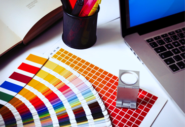
Photoshop users can choose RGB or CMYK—which really are day and night options in how to present color. RGB (Red, Green, Blue) is used in different proportions to create new colors (e.g., red, green and blue actually create white). It is an additive format, meaning that they combine to create the desired color on a digital screen. CMYK (Cyan, Magenta, Yellow, and Key) is subtractive, so instead of white being the combination of all colors as with RGB, white is the absence of color.
Technicalities aside, when customers give you RGB-formatted images to translate into print, the color may vary considerably from its on-screen counterpart. What looks so vibrant and bright on a monitor may look dull and dark when translated into print. RGB photos pulled from websites for convenience and easy accessibility often look sketchy when printed. For that matter, images render differently on different monitors (think about looking at different TVs at a bigbox store)—much less trying to make RGB do double duty in the print environment.
Some proactive education can save your customers, and you, time, trouble and money. Perhaps the easiest way to demonstrate the differences it to show examples of images created from both formats on a variety of label and packaging presentations to see the differences side by side.
Color/image accuracy, clarity and crispness always should take center stage on labels and other printed products. This is your customer’s frontline branding presentation and it deserves the right format. That format is CMYK.